Solana Pay is a set of payment standards and protocols that enable merchants to directly accept US digital dollars at the point of sale, with instant settlement and virtually no cost. This is a truly decentralized payment system with no intermediaries or material fees.
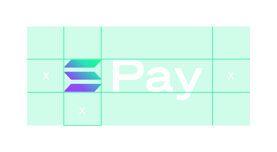
A certain amount of space is needed around the Solana Pay mark to prevent it from becoming cluttered by surrounding artwork, images, or the edge of a page. Below are the minimum spacing requirements.
Solana Pay Mark and Buttons
The sections below provide an overview of the different ways in which the Solana Pay mark can be represented. Included here are several button configurations that you can use in your designs to consistently represent the ability to pay with Solana Pay.
The button consists of the Solana Pay mark as well as multiple options to communicate Solana Pay as a payment option.
For consistency and recognizability, please don’t use your own designs of the Solana Pay button.
Please only use the artwork for the Solana Pay mark that we’ve provided, with no alterations other than height. You can specify a height for the Solana Pay mark so long as it is equal to or larger than other payment mark options in a checkout or payment flow.
Do's
Appropriately size with other payment options
Dont's
Don’t adjust the width
Don’t adjust the corner radius or aspect ratio
Don’t add other visual effects
Don’t use low resolution
Standard Button
Descriptive Button
Descriptive Options
Dark Button
Outline Button
White Button
Solana pay mark - Black
Solana pay mark - Gradient
Solana pay mark - Gradient
Solana pay mark - White gradient
All Button and descriptive button assets


